Capalbo Italian Wines
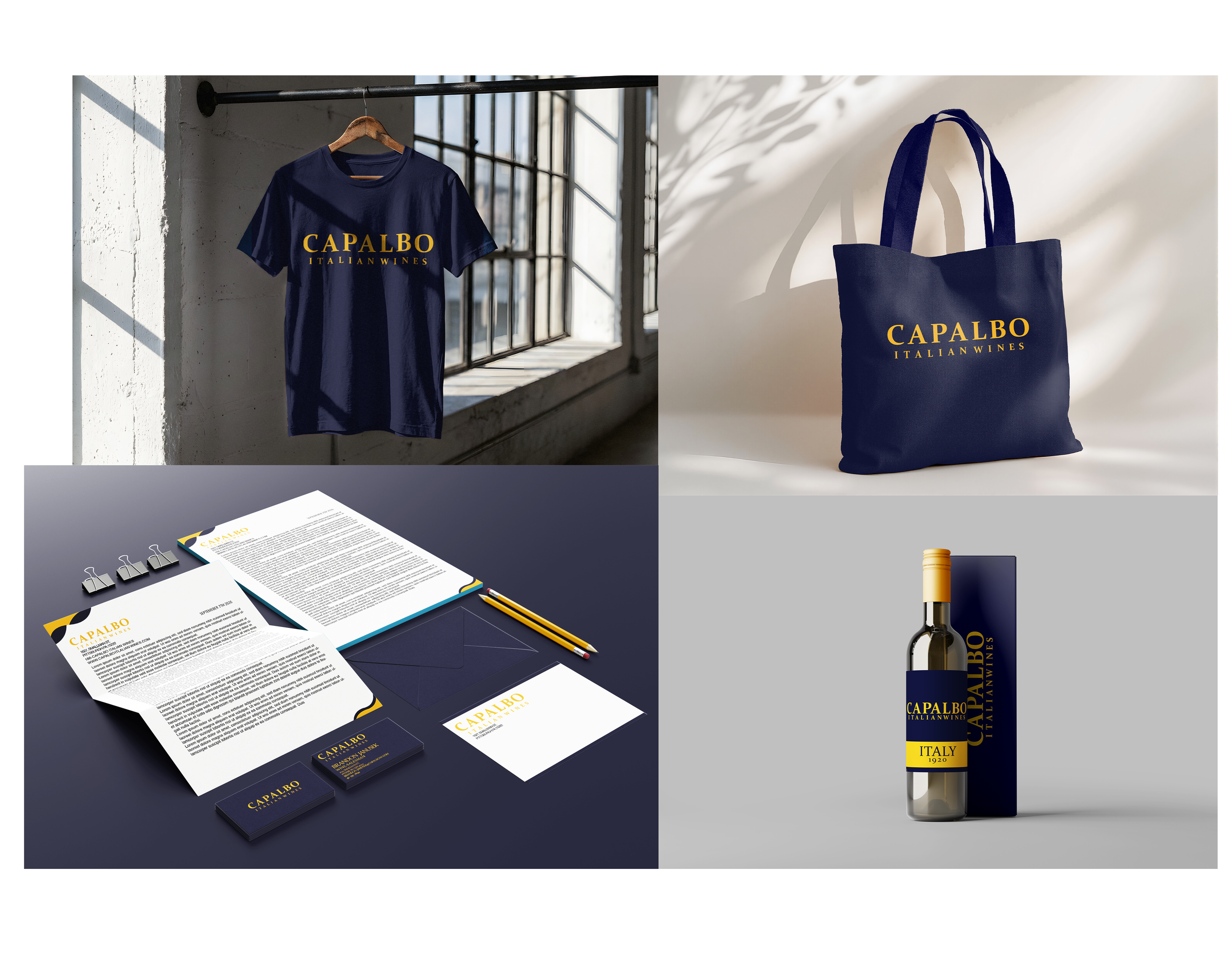
The newly unveiled brand presentation for Capalbo Italian Wines exudes a timeless, sophisticated charm. The identity is built upon a striking contrast between deep midnight blue and warm, golden typography, creating an aesthetic that feels both premium and deeply rooted in European tradition.
The branding moves gracefully from digital assets to physical, everyday touchpoints. A rich navy t-shirt hangs elegantly against a bright, sunlit warehouse window, showing how the bold gold lettering commands attention even on casual apparel. Beside it, a textured canvas tote bag catches dramatic shadows on a gallery wall, proving the brand's effortless lifestyle appeal. The stationary kit is meticulously arranged on a dark desktop, featuring elegant letterheads, crisp matching envelopes, and sharp business cards that make a powerful first impression. Finally, the true centerpiece is the wine bottle itself, standing proudly next to its minimalist gift box. The clean, blocked label architecture brings a modern twist to a classic Italian heritage, resulting in a cohesive brand experience that feels thoughtfully crafted from top to bottom.